Our confidential client wished to create a connection between their Chicago and suburban workplaces. What emerged from the initial concept development was a strategy to utilize Chicago nomenclature and iconography to make the connection and organize this very large workplace.
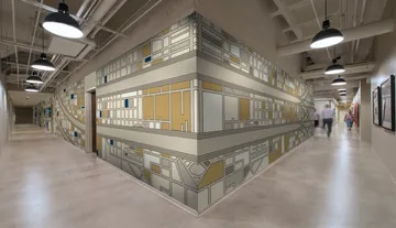
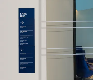
To enable successful wayfinding, Kahler Slater used a combination of signage, landmarking and theming in the design solution. The building’s core was elevated to become the key landmark in the space. This wallscape was wrapped in a custom-designed graphic inspired by Chicago’s street grid and iconic ‘L’ transit system. From there, ‘L’ tracks extend deep into the workplace as white distraction vinyl on glass office fronts. On either side of the core, the workspace was themed to reference Chicago’s lakes and parks. This drove the conference room naming, room signage and interior color palettes. This theming, in addition to carefully placed guide signs, helped make the space feel smaller and easier to navigate.
To welcome employees and guests into this workplace, a wall sculpture feature was interpreted as Chicago’s iconic city grid. This identity piece represents the buildings and streets of Chicago using a series of wood blocks painted and cut to various sizes.
